Crosstab Layouts
In a regular nested table layout, records are stacked in the vertical direction only, with the table header unaffected by changes in the data. A crosstab layout, by contrast, allows grouping in two dimensions, with table columns repeated once for each value in the horizontal grouping.
Crosstabs are useful on wide screens, when grouping yields a few distinct values that can be compared side-by-side. Such visualizations are also known as “trellis charts” or “small multiples”.
For Excel users, you can think of a crosstab as a Pivot Table with fields specified in both rows and columns. Ultorg crosstabs are more flexible, as they allow nested tables in the central area, rather than just the result of aggregate functions (sum, count, etc.).
Crosstabs can combined with bar charts and heat maps. Numbers to be visualized can come from fields in nested table rows, as seen above, or from aggregate functions, as seen below.
How to Use
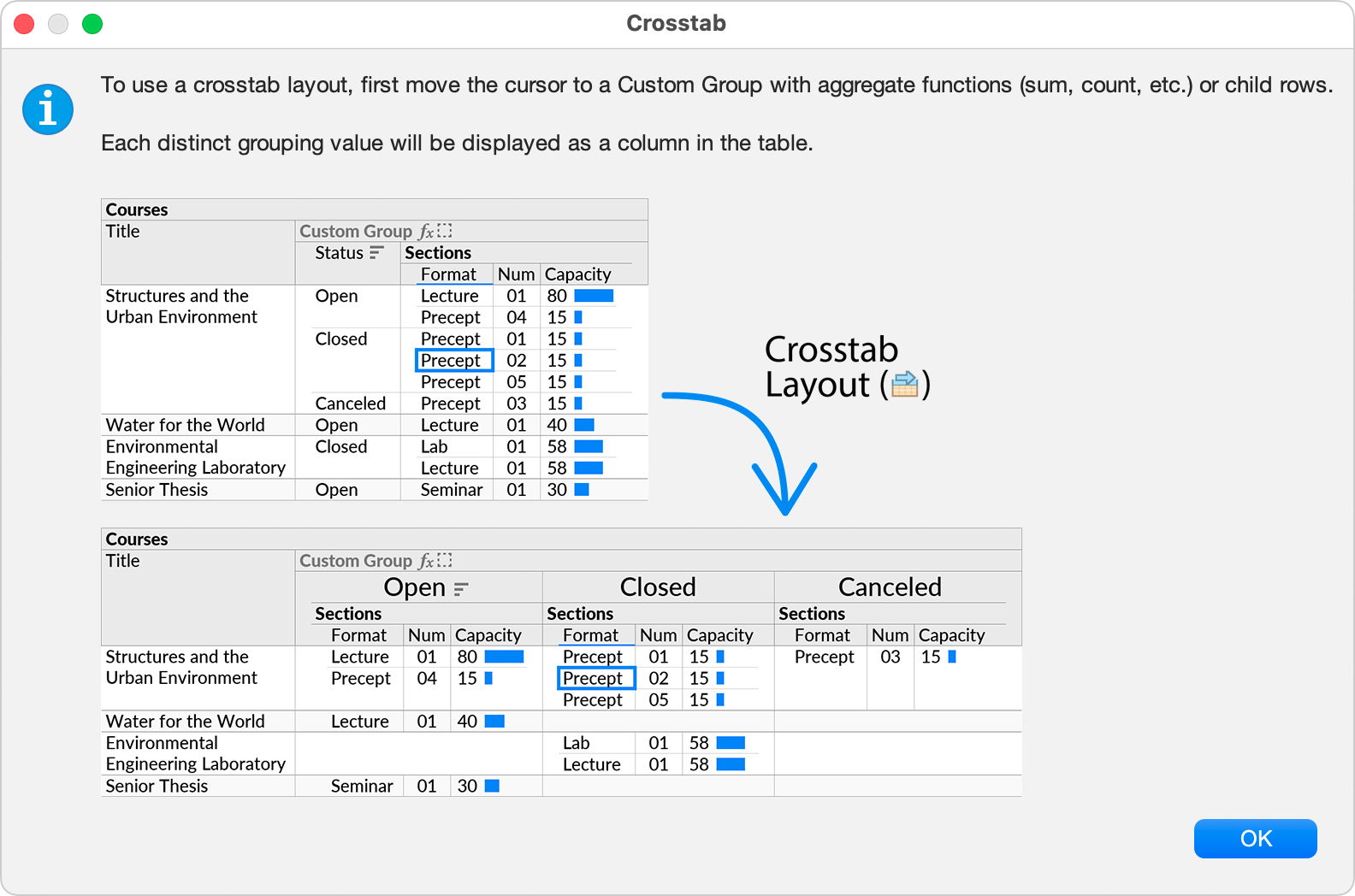
To use a crosstab layout, move the cell cursor to a Custom Group, and enable the Crosstab option (![]() ) from the toolbar or the Format menu.
) from the toolbar or the Format menu.
If a crosstab cannot be enabled for the current selection, an informational message is shown.
Step-by-Step
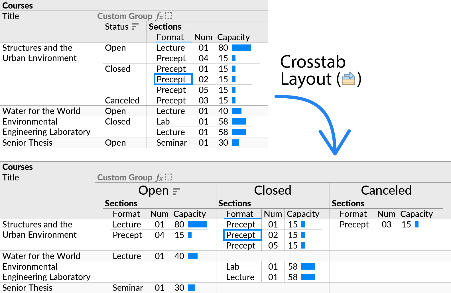
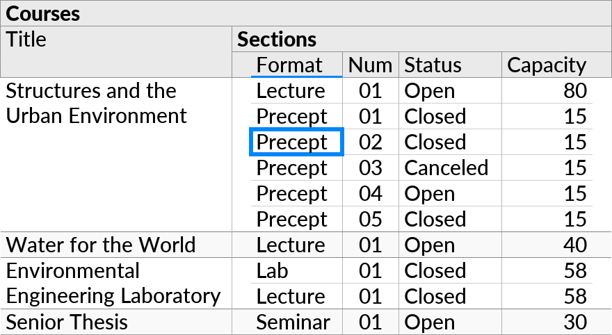
To create a crosstab layout, first ensure you have a one-to-many relationship that represents the grouping you want to see in the vertical (up/down) direction. This can be either join or a Custom Group. For example, here we have a join between the “Courses” and “Sections” tables:
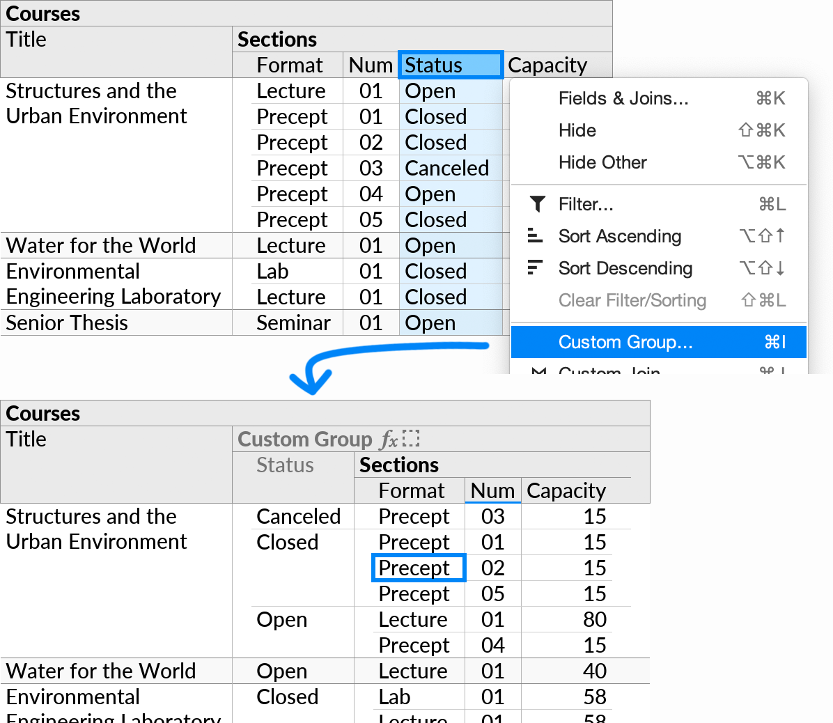
Then select the field(s) you want to group by in the horizontal (left/right) direction, and invoke Custom Group. Put the new grouping level in the middle of the two existing levels (usually the default). For example, here we group by “Status”:
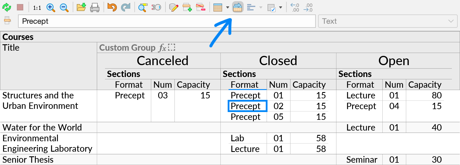
Finally, place the cell cursor anywhere within the inner grouping, and click the Crosstab icon (![]() ) in the toolbar.
) in the toolbar.
Aggregate Functions
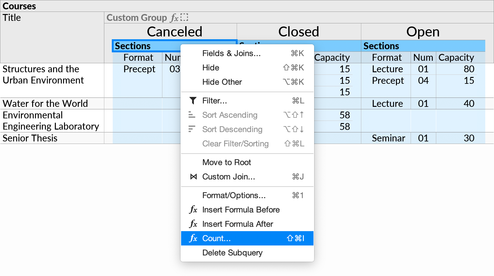
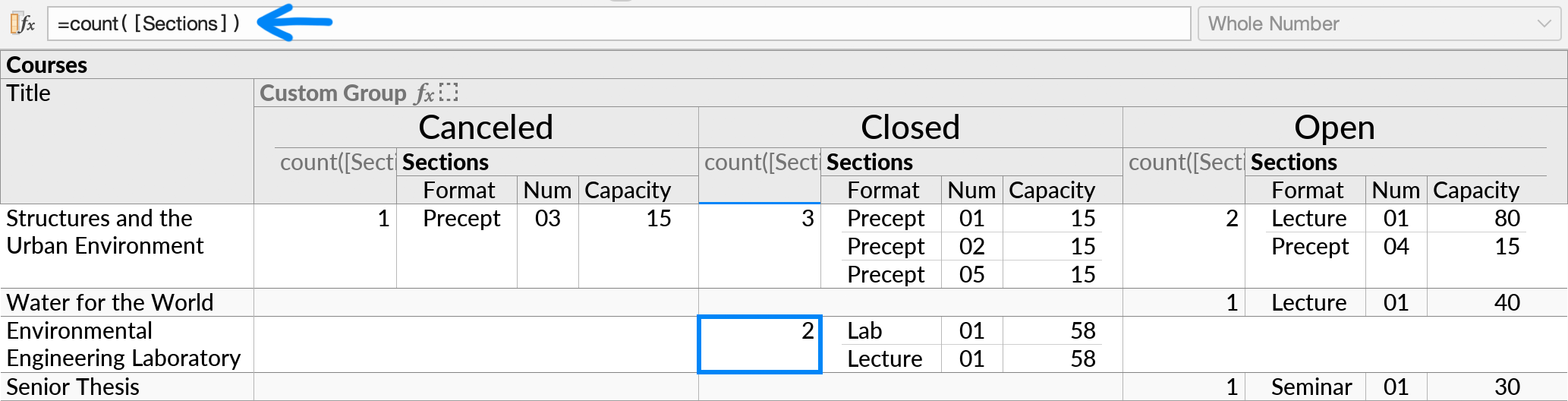
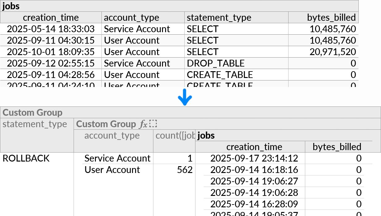
If the horizontal Custom Group contains formulas with aggregate functions, their result will be displayed in the central area of the crosstab, together with their nested input rows. For example, we can Count the number of open, closed, and canceled Sections per Course:
The result is as follows:
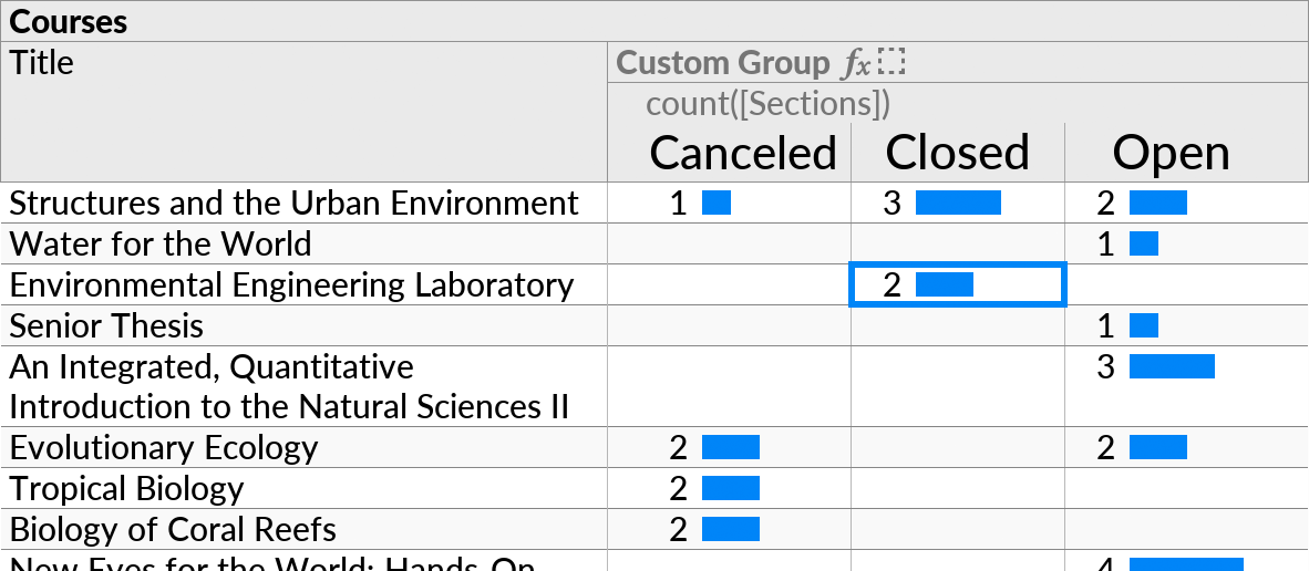
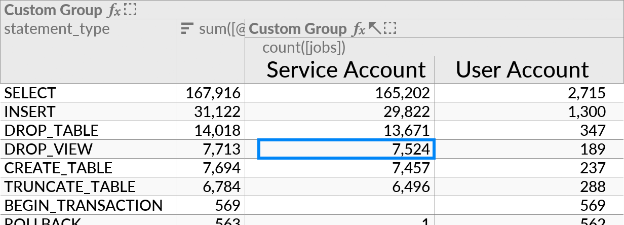
To see only the aggregate results, you can hide the Sections subquery. This leaves a simpler layout, similar to a pivot table in a spreadsheet. The bar chart (![]() ) option will also work well here, when enabled on the aggregate result:
) option will also work well here, when enabled on the aggregate result:
Single-Table Datasets
If your data source has only a single table, you can use Custom Group twice to set up both the first and the second grouping level.
Then select any cell within the grouping, and enable the Crosstab option as before.
Multiple Header Fields
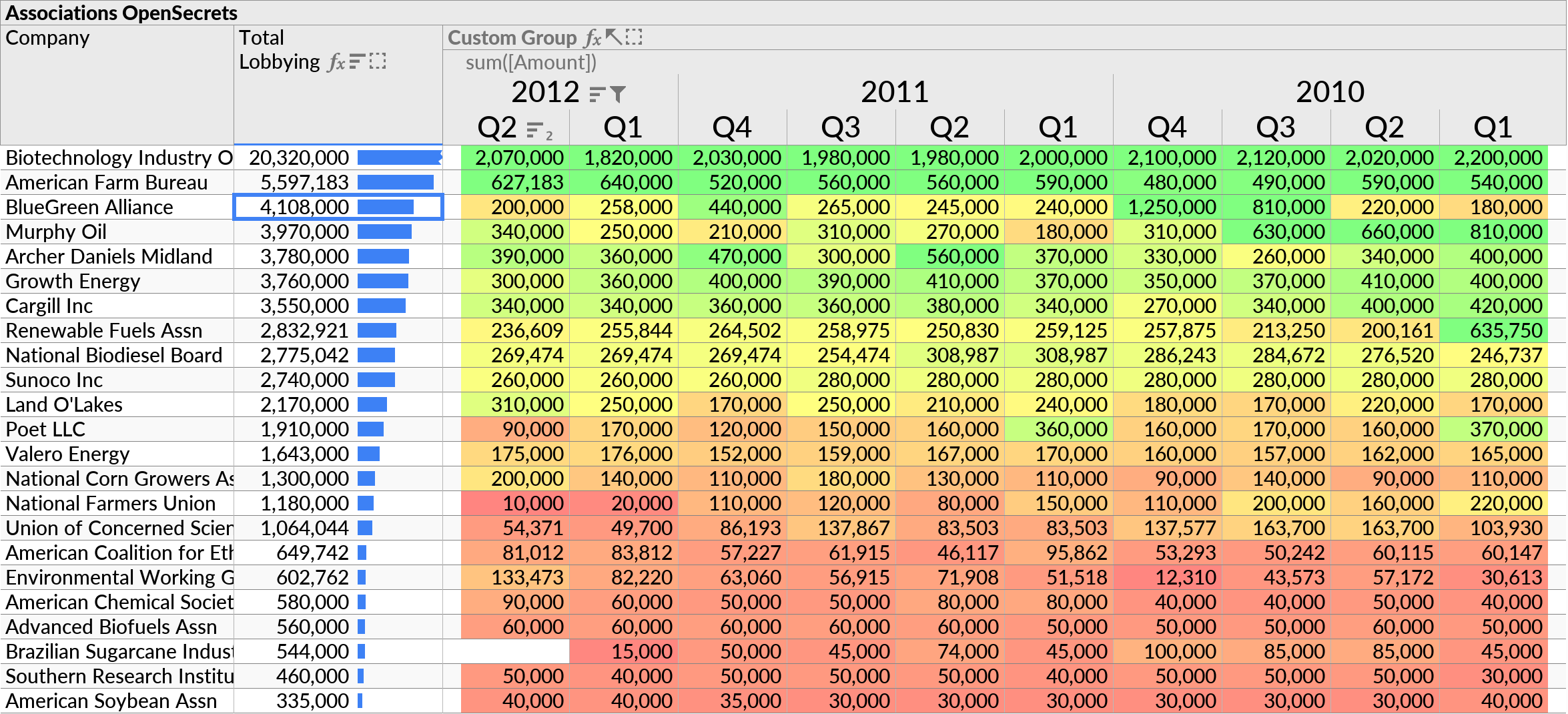
The horizontal Custom Group can include multiple fields if desired. Repeating headers will be merged for display purposes. For example, we can show sales totals by year and quarter:
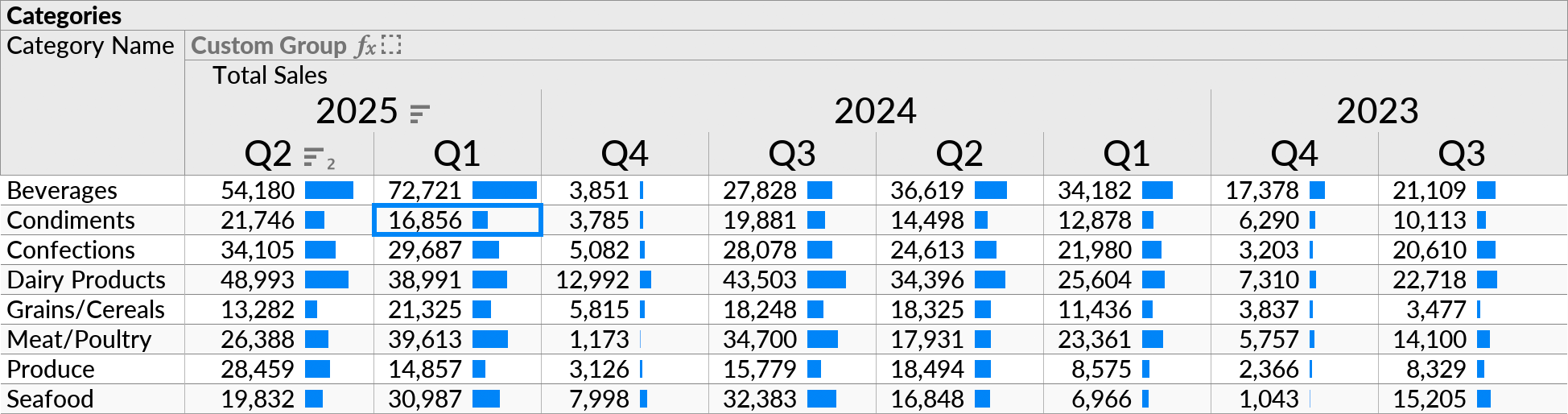
The example above was created by enabling the Crosstab option on the following perspective:
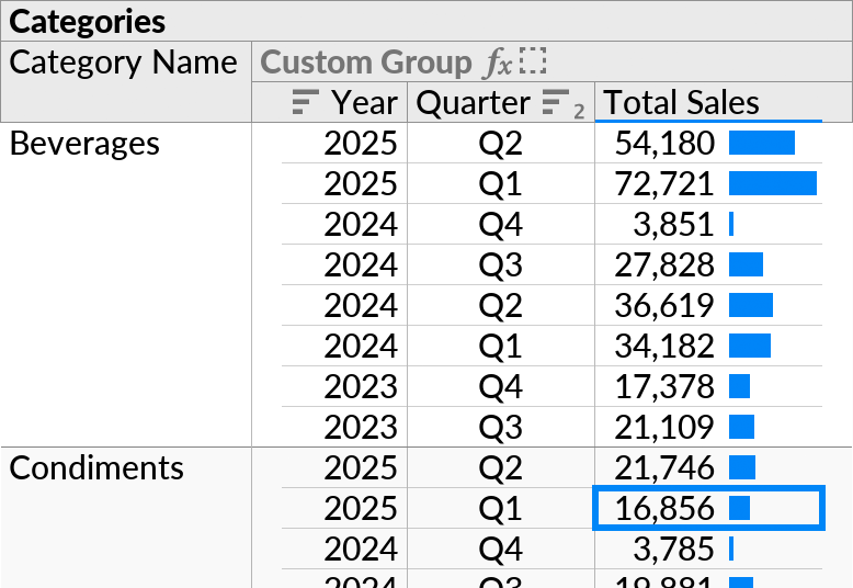
The data in this example comes from a hidden “Products” subquery, which is shown below.
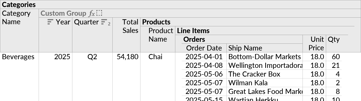
The three formulas in the Custom Group were defined as follows:
| Year | =year([Order Date]) |
| Quarter | =concat("Q", floor(month([Order Date]) / 4) + 1) |
| Total Sales | =sum([Unit Price] * [Qty]) |
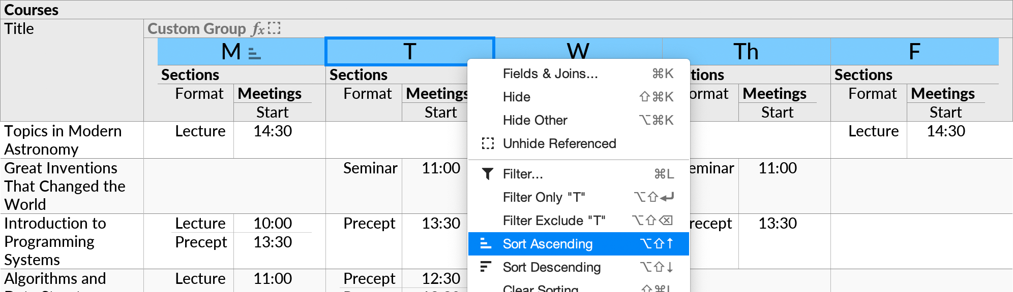
Header Actions
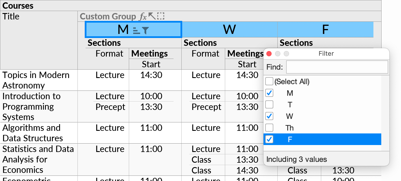
The usual context menu actions can be invoked on the values in the crosstab header.
For example, you can sort the values to change the order of the crosstab columns:
Or, you can filter to include only certain values for the crosstab columns: